

THE WOLF’S TAILOR
MICHELIN STAR | MICHELIN GREEN STAR
A Nod to the Fable of The Wolf in Sheep's Clothing.
Sunnyside restaurant, The Wolf’s Tailor, marries an unexpected combination of food and culture, Italian kitchen and Asian street food. And, because this is the brainchild of James Beard award-winning, Id Est Hospitality’s Chef Kelly Whitiker, The Wolf’s Tailor takes the concept just one step further, posing the questions… “WHO is responsible for creating that deception? WHO crafted the Wolf’s most iconic look?” Integrating the disparate concepts of “bespoke Italian tailor” and “Japanese lino-cut carvings and shadow puppetry,” the brand identity is purposefully pushing boundaries.
Creative direction + brand design for Paper Laundry. Architecture + interiors by Regular. Hand-paintING by Atlas Sign Co.


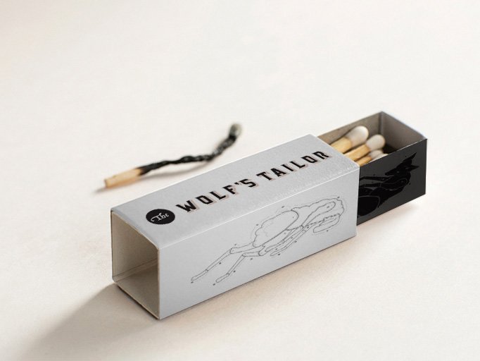
CUSTOM ILLUSTRATIONS CAPTURE THE CAST-OFF COSTUMES OF THE WOLF AND THE SHEEP. INTENDED TO BE SOMEWHAT UNCOMFORTABLE, THE PELT ILLUSTRATIONS CHALLENGE WHAT’S ACCEPTABLE IN THE HOSPITALITY FIELD. THE MATCHBOX CONCEPT TAKES THIS A STEP FURTHER, CREATING A SUBTLE WINK TO THE EXPERIENCE OF THE WOLF DISROBING FROM THE SHEEP SUIT.


T A I L O R D A R K L Y S M I L E S
T H E Y D I D N ’ T S E E I T C O M I N G
W H I C H S U I T S H A L L H E W E A R ?


MENU CONCEPT
Intended for print on rice paper, the menu design is a continuation of the theme of thoughtful detail. TWT is a minimal-waste concept, so a compostable menu fits right in.

The trope of storytelling in this brand appears in unexpected ways. Like hands forming shadow puppets of the wolf and the sheep as a subtle nod to the ancient craft of Japanese puppetry.


THIS RESERVED COLOR PALETTE WAS INSPIRED BY THE COATS OF OUR TWO MAIN CHARACTERS — A DEEP WOLFISH GRAY-BLACK AND WARM, WOOLY SHEEP WHITE.
The bold contrast also suggests two major components of TWT cuisine: charcoal and flour for both Japanese soba noodles and Italian pastas. Sparing use of pale, millennial pink gives the brand a touch of modernity. Beautiful brassy gold tones imbue the brand with a classical air.


Hand painting signage by the very talented Brendan Lenahan of Atlas Sign Co.